I am particpating in an altered book show at the Museum of Contemporary Art starting April 21st, at Hamilton Field in Novato, CA. Today i dropped it off at the museum. My book is called Cornucopia - a celebration of nature's bounty! I took apart some silk flowers , stacked the petals with a brass brad, and glued the petals onto the cover with glue dots. I used an assortment of Tim Holtz grungeboard letters to spell out the title. I painted them green, added some copper paint to the edges and added a bit of gold leaf. A bunch of tacky glue on the back and pressed them into the flowers, weighting them down with a pile of books.
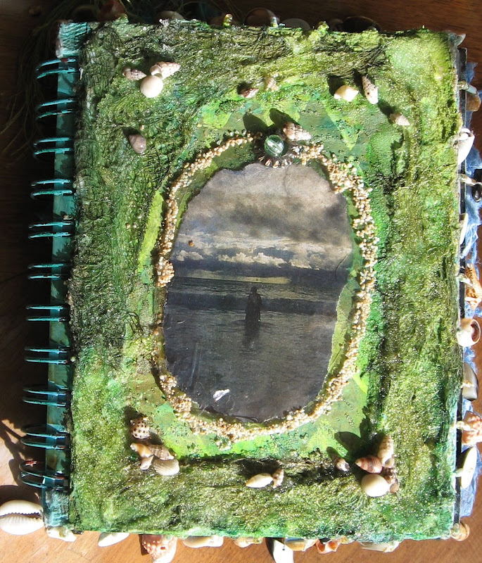
Here is what the book liked before i started. It is a financial ledger from 1972-1973 i found at an estte sale. I cannot tell what the business was, but they had income from several major companies, and a membership to a dancy club in La Jolla!
I removed a lot of the pages carefully - there was only one signature (sewn pages) - so i pulled tem from the middle. I left about 20 pages - enought to glue two pages together and have 10 spreads. The pages i tore out will come in handy for other paper craft projects.
Here is the plain old back of the journal. I gave it a quick sanding and a light coat of gesso to prepare it for decoration.
For my backgrounds inside the book i used painted deli paper. I have written may times about the joys of painting deli paper with acrylic paint and a credt card. It is so much easier than painting directly in the book. My deli paper was 12" square and the book was a perfect 12" tall. Sadly i was more than 12" WIDE, so i painted two of each colour combination (three per page) so i could piece them together. it is fun how the three colours (here orange, aqua and yellow) combine to create 5 different hues, when scraped together on the page.
I kept my title page simple, just adding the title, with my name below. this was printed on normal computer paper. it is funny how it looks like vellum! I used Portfolio oil pastels to blend the colour onto the white sheet. It is softer than he background - but less jaring than plain white.
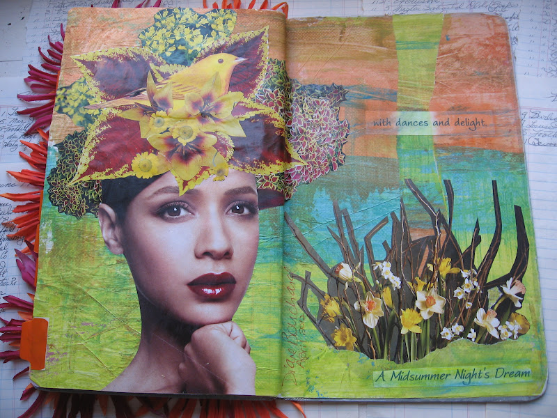
The "recipe" for each of the 10 spreads was the same:
1. deli paper background
2. pretty face
3. flowers
4. a bird or butterfly, or maybe not
5. a line from a quote from Shakespeare's A Midsummer Night's Dream.
For the page above i used a striking red head and a cornucopia of fruits, vegetables and flowers evoking the autumn harvest.
No critters on this spread - just a woman throwing her head back with a cascade of lavendar and pink flowers. You might notice that each page has two of the same colours as the previous page. Sometimes it is subtle due to the blending of the paint. The pink and orange bands fromthe previous spread drop down and lavendar is added at the top.
This is one of my favorites. The beautiful purple and violet flowers call to a similary hued hummingbird to come and take a drink. Note how the pink and lavendar from the previous background are now joined my a ribbon of yellow.
Blues and yellows make up the flowering headress for this super model, with a bright blue parrot coming along for the ride.
I went sort of pop art with this spread - one eye and one big blue poppy.
Another familiar face with an underwater effect of blues and greens, and water droplets on the petals.
Orchids and glittered butterflies add a touch of the exotic to this smokey eyed damsel.
More poppies - this time pinks and corals create a perfect nesting spot for a couple of pastel feathered birds.
Poppies and roses and a couple of winged creatures for this sun drenched gal.
And my final pretty face, with an exuberent headress of red and yellow leaves and the perfect spot for a wee yellow birdie.
Here is the back of the book, i covered it with a leftover piece of deli paper that most matched with orange and pink flowers on the front. A sticker with my name and contact info complete the book.
And once again - i present Cornucopia! This and 150 other altered book or book inspired artwork will be available to purchase through a silent auction running from April 21st through May at MOCA. Please come to Novato and see the show.
And now i seriously have to do my taxes....seriously.


