For the latest monthly round of the altered calendar round
robin, I once again had the book 1963 to work in. Please see my previous pages HERE.
When you google September 1963 to find stories or ideas,
sadly you learn about the horrible bombing of the church in Alabama where 4
your girls died. I debated creating a spread about that for a few
minutes, but decided I was not well suited for such a serious topic in my
art. Instead I went with the two other most common google search
responses – vintage magazines and the new fall TV shows.
My first spread is a nod to K’s car crazed husband with the
cover of the Sept 1963 Motor Trend. yes –it says 1964 cars on the
cover – because September is when the new cars come out!
Inside I
showed a spoof car ad from MAD magazine from the same year. It talks
about how useless you feel when they do come out with the NEW cars, hence a
marketing ploy to see you a 1963 and ¾’s car – in this ad – a re-issue of the
Edsel. Yuk yuk. Both pages are covered with wide packing tape to look glossy like a magazine.
The next spread features a 1960’s era family room, probably
somewhere in sunny southern California. I wanted to do something
ambitious where the TV screen would be a window onto the next page – but
had to scotch it. So it is just a cool mid-century modern family room! I chose the collegiate letters and the autumn leaves, two things that signify back to school and the big issue of TV guide!
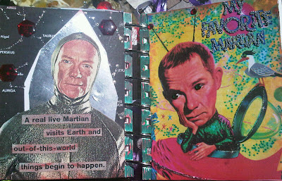
Next spread has one of the new TV shows for 1963 – My
Favorite Martian. I found two images of Ray Walston (Mr. Hand to you 80’s
loving movie go-ers) and glittered them up with jewels, stickles and metallic
flecks. The space ship on the left is metal duct tape. it was just a bonus that there is a cute bird on the right!
Another new program launched in September 1963 was The Judy
Garland Show. In the early days of my altered book journey, it was hard
to find images for a specific spread. Nowadays you can find just about
anything in Google images. But interestingly, there were very few images
from the show that were bigger than mere thumbnails. You can specify
“large” images in your search, so that they will print out crisp and clear and
you can size them however you like to fit your collage. Not to get into
copyright laws or anything (a lengthy topic in the collage world) but in my
opinion if I am using images for my own use, i.e. not to resell, there is
nothing wrong with it. I will never post images of another person’s
artwork here without giving them credit. Or better yet – add a link to
their website.
Ok speech over! So I found a telegram that Judy sent
Sid Luft in 1963. (it wasn’t in September – but I hid that on the
page!) Still relevant, don’t you think? The image on the left was
actually from the Andy William show, with Andy cut out! The image on the
right in the stunning sequin/zebra gown was the only one I could find of any
quality. I used a background of some black textured paper to echo the
stripes and added some white and black glittery strips. The green seaweed
with “cool” on it was so perfect – it was just a scrap on my work space
left over from a prior book, “under the sea!”!


No comments:
Post a Comment