
This is the facade of the D'Orsay Museum - formerly a train station for the Paris - Orleans Railway. It is quite remarkable how extravagant the architecture and ornamentation is for something so pedestrian as a train station.

All the towns visited by the trains are carved into the side of the building.

It is crowned by rows of elaborate sculptures.

Remember - this wasn't a palace - it was a TRAIN Station!

View from the D'Orsay to Sacre Coeur.
Now onto a sampling of the amazing impressionist paintings....

Manet

Degas

Degas

Van Gogh

Van Gogh
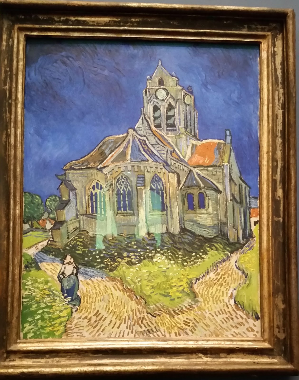
Van Gogh

Maurice Denis

Pissaro
 Sadly only got to see a snippet of a Monet waterlilies. The Orangerie gallery which has most of the large paintings was closed.


Renoir

Renoir

My Sister-Law Tammy!
(on display at my sister's house, not the D'Orsay)
BTW - i wasn't like the Asian school girls giggling through the salons taking selfies and not really LOOKING at the art. I sat and studied these paintings - i just grabbed a few snapshots to remember this wonderful experience.
BTW - i wasn't like the Asian school girls giggling through the salons taking selfies and not really LOOKING at the art. I sat and studied these paintings - i just grabbed a few snapshots to remember this wonderful experience.

Opera model

One of several clock windows


Many beautiful marble sculptures.

A segment of a model of a door done by Rodin.

And here is a quick glimpse of the ACTUAL thinker at the Rodin museum, a few blocks away.

And here is a quick glimpse of the ACTUAL thinker at the Rodin museum, a few blocks away.

Bear

Ceiling detail. this was a TRAIN STATION people!

Another clock

Interior shot

Replica of lady liberty

E and Dee at the D-Orsay cafe.

A brief pause for Limoncello sorbet and Kir Royale. As one does....
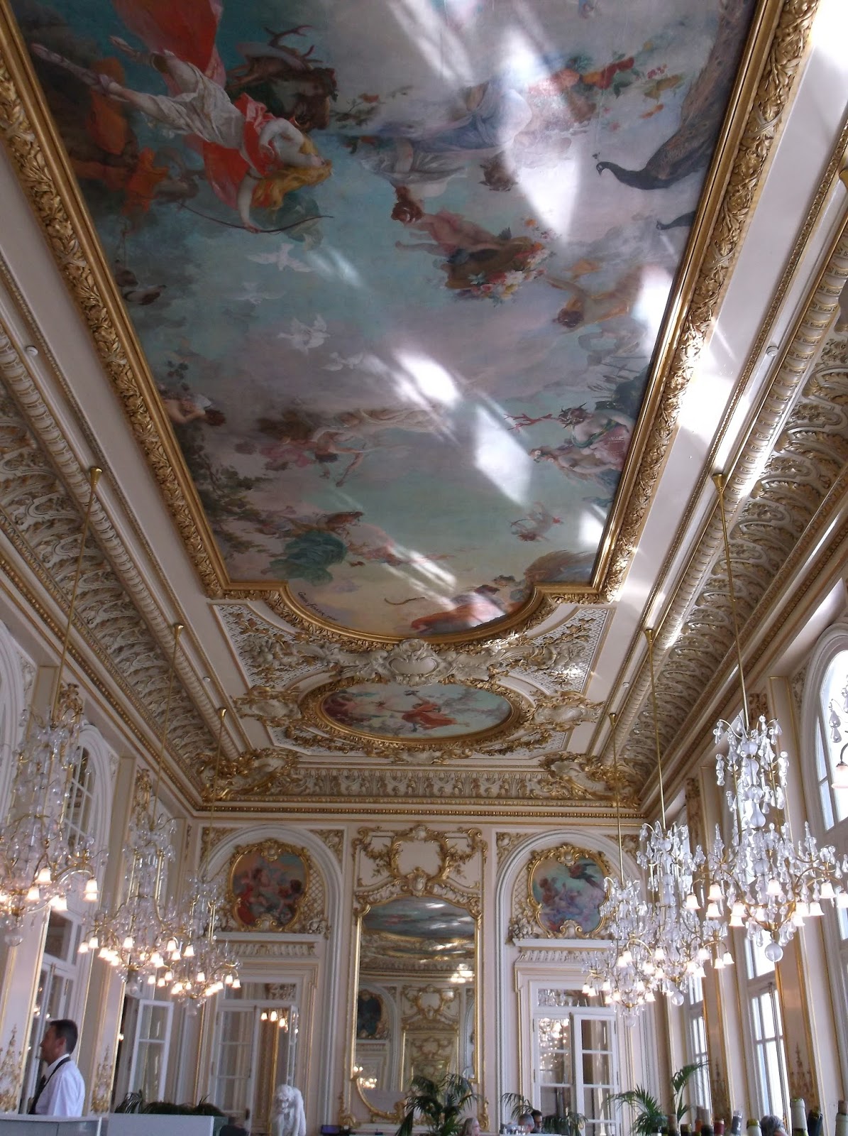
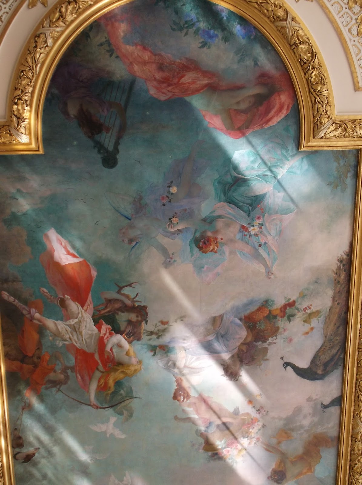
Painterly ceiling decoration at the museum cafe - the original ballroom for the D'orsay Hotel.


We were also able to see the special exhibit of Italian art from 1900 to 1950,

I loved this poster,

Not an impressionist work - but i loved this piece by Sartorio -
part of the Dolce Vita! exposition.
What a magical relaxing therapeutic day we spent at the D'Orsay. There are dozens of museums to choose from, and i am sure they are all amazing. but with limited time, i think we made the best choice.
part of the Dolce Vita! exposition.
What a magical relaxing therapeutic day we spent at the D'Orsay. There are dozens of museums to choose from, and i am sure they are all amazing. but with limited time, i think we made the best choice.


