Sunday, January 27, 2013

Visiting Port Costa

Theater of Dreams
I meant to post this last year, after visiting the magical world of Wendy Addison in Port Costa, California.  For only a few weekends a year, Wendy opens her little shop for holiday shoppers.
Inside you mind vintage fixtures holding imaginable treasures that take you back to some mysterious time.
 Here are three little german glitter birds i purchased.  They were a lovely addition to my bird themed christmas tree this year.
 I picked up two bears- all dressed up in vintage bullion fringe for their circus debut.
 And finally a card making kit with lovely circus themes stickers.
If you want to visit Wendy's shop - check out her website next October for her open house dates.

Altered Book Themes


I thought i would show you all the books we created last year in our monthly altered book swap.  Here are the books from 2012 - all fat and chunky after their 12 month tour through 6 participating artists.
Clockwise from top left:
SeaGlass - Miss L
1963 - Miss K
Beach House - that's mine
Dance - Miss Z
Under the Sea - Miss S
The Map and Moustache Book - Miss D

And here are the books for 2013:
The Odditorium - Miss S
Flower Sampler of Mixed Media Art Techniques - Miss Z
Once Upon a Time - Miss K
Paper Dolls - Miss L
Through the Sepia Lens - Miss D
Just One Word - Mine 

Check back often to see each book in closeup as they journey through each artist...!

Calendar Swap 2013 - Just One Word

 Our monthly gathering for play dates and altered books swaps kicked off 2013 last weekend.  We each received a new blank calendar to use for the swap.  Same as last year - the little spiral bound calendars are a nice size to work in quickly.  No stress - just fun!
For my new book i went with a theme called Just One Word.  the concept is that you will create a spread - any style you like, then add ONE WORD to describe it, or express a mood of feeling, or whatever!
To emphasize the theme - the first few pages of the book express this boldly.   For this spread i used 4 different background papers and added gesso to soften the patterns.  then some yellow and green ink.  The word JUST is raised up on thick glue dots.
  Here is ONE.  My friend Z created the bird stamped muslin ribbon on top of the page.
 And WORD - the background is a combination of printed paper and tissue paper.
 Here is the introduction page for the artists who will work in the book.  The tag came from Wendy Addison and said "open me" but of course - since i can only put ONE WORD on the spread, i had to cover up the "me".   The notes to the artist are inside the envelope.  I explain the concept and let everyone know that foreign text, or allover text used as a background are ok.
Here is my first spread in the book.  I took the image of Venus by Botticelli, and cut her out from her background.  I placed her instead on a blue sky with some white clouds.  On the left i created a collage landscape using strips of blue and green papers to evoke the sea and the sky.
I added my one word: idyllic.
Here you can see in the original what i was hoping to achieve.
 For my second spread i used some images of fast moving water over mossy rocks.  I created some interest on the page by adding strips and a couple of puzzle pieces.  The word i chose - Rush, 'cus you know, that water appears to be in a hurry....!
And finally here is my sign in page.  only, yeah it just says SIGN, per the one word per spread rule.  I used Mexican bingo cards for the sign in cards.  Each artist will decorate, add fibers, whatever they want, and place it in the other envelope.

Sea Glass - Altered Book Swap

For the final book swap of 2012 i worked in my friend L's book entitled Sea Glass.  Early in 2012 she moved away from the Bay area to Port Townsend in Washington State.  But we continued to swap books every month.
 I created this spread in her book by removing the two pages from the spine and taping them to the edges of other pages to create an "open sesame" kind of doors to what's underneath.  I found the vintage picture of her new home town in an on line search.
 Flash?  No flash?  there a benefits to both.  Daylight is best!

 The added pages create a long spread of 4 pages.  I found various pictures of the Washington coastline, featuring stones and rocks and driftwood and full on tree trunks - is sun washed grey tones. I spliced them altogether to create a collaged landscape.   I added the glitter and sequins to create a magical treasure trove of sea glass along the shore.
 Continuing up the page you follow a meandering path up the steep hill to where L's new house is situated.
The cashmere goats are an inside joke.  I don't believe they actually have goats roaming the slopes of the hills around Port Townsend, but they might....!

Friday, January 25, 2013

Abstract Landscape Collage


This past Sunday our FULL GROUP of artsy pals got together for a special play date.  It was our year end altered book swap and the start of a new year - which i'll share in a different post.  But our activity for the play date was to create abstract landscapes a la Jane Davies
 Our friend L. took a workshop with Jane and showed us how to start off with a series of sketches to illustrate that a landscape doesn't necesseraily mean a horizontal horizon line.
 Here is a shot of the inspirational artwork L created at the workshop.  We couldn't wait to get started.
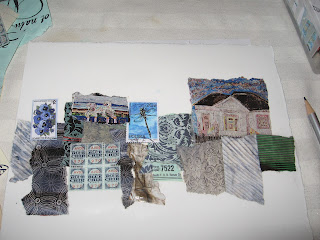
 We used American Masters Printmaking Paper from Utrecht as our base.  They were folded and torn into sheets about 8x10.  Using matte medium (Utrecht's in a tube) and a credit card, glue scraps of paper to the sheet - smoothing well with the card.  No excess glue.
 Although it is not meant to be "literal" i liked the idea of using little buildings. You get to have two or three pieces going - so you can let one dry.
 For my third i chose to use all text with a bit of texture thrown in with the gold mesh and the doily.

Then you start adding colour.  Keeping a contrast between the top and the bottom - add colour with a stiff brush - overlapping the papers here and there.  There is no magic - just go for it!  Add a lot of white to the acrylic paint to get a softness.
 There is no rule that the sky must be blue and the grass green - Here i went for a bold orange red sky and a watery sort of forground.  You can then add texture with bubble wrap, sequin waste as a stencil, or with various drawing tools.
 Here is K's dramatic piece with a lot of black and bright colours.
 I am sorry i cannot remember who is responsible for this one - but it is great!
 This one too!
 And this one also!
 I think these were S's.  the only one who ventured into the realm of the aforementioned alternate horizon with the string diagonal.
 This is one of L's new pieces.  Most of her paper strips were laid vertically.
Here is another.  We were all very impressed with L and learning this cool technique!

Wednesday, January 23, 2013

Altered Tin Signs


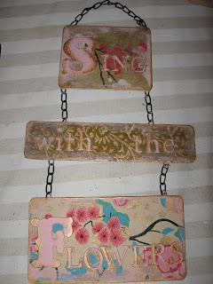
 At our first play date of 2013 we each altered a blank black metal sign.  Here is one of mine - "sing with the flowers".  I'll probably add some additional embellishment - like paper flowers, leaves and perhaps a butterfly or two.
 This what the blanks looked like before we started.  painted black - we roughly sanded them to allow our papers to stick a bit better.
You had a choice of a three or 4 section sign.  I purchased them online through Pick Your Plum - one of those daily deals sites.
 First i glued pretty papers to each section  - i used a bit of sand paper to scrape off the edges.
Next i painted my letters.  I added some ink to the edges after they were dry.
Next it was time to figure out the spacing and glue them on.
 For my second sign i glued the letters directly to the signs. Make the people Laugh and Dance and Sing is what i say to my husband when he goes out to play a gig!
I covered the sections with heavy metal duct tape - the kind with the super sticky backing.  I carefully outlined each letter to make them have that embossed licence plate effect.  Then i used adirondak ink - sponged on to give a mottled metal effect.
 Here is Z's sign in progress.  She went with a neutral theme - and used France as her influence.
 Salle de jeux translates as play room or game room. 
 Here K was trying our various funny family expressions. 
 But this is the one she went with - using a masculine black and silver colour pallette.
Here is D's colourful plaque - probably going to hang in her classroom - the lesson for the day: Laugh - Love - Live and Learn!
And finally here is S's sign wiht a collaged background with a cheery message for us all!